
When a display adapts itself to help an analyst, it seems obvious that more intelligent adaptivity should help more. In SYMBIOTIK’s second SOC use case we set out to test that assumption and found something more useful than a confirmation. We showed thirteen participants 48 cyber threat intelligence graphs (624 trials in total) and asked a question about each. The graphs were presented in three different forms. In the first one, every attribute was plain text: entity type, Traffic Light Protocol marking, number of relationships, edge confidence. In the second, exactly one of those four was encoded visually (TLP as node colour, say, or relationship count as node size) while the rest stayed as text. In the third, all four were encoded at once.
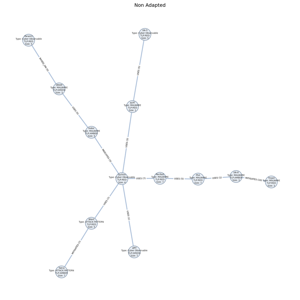
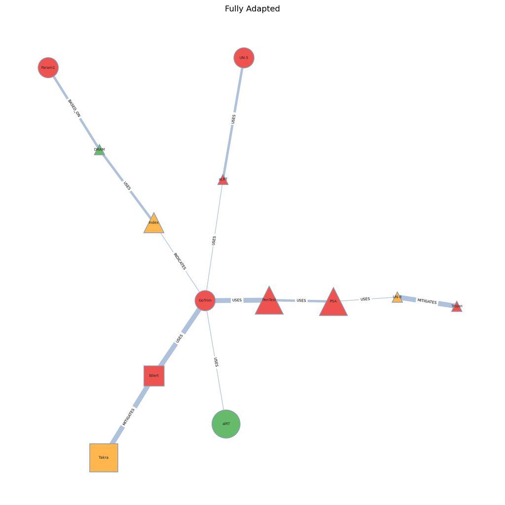
The fully adapted graphs were answered faster: a median of 7.2 seconds against 9.5 for plain text. The interesting result came from the graphs carrying just one encoded attribute. When the question happened to be about that attribute, people answered in 5.3 seconds; i.e., barely indistinguishable from the fully adapted version at 5.6 seconds, and three seconds quicker than text. One visual channel did the work of four! But when the question required two attributes and only one was encoded, the advantage vanished completely: 12.1 seconds, against 12.3 for no adaptation at all. The second attribute still had to be hunted down and read, and reading is where the time goes. A partial adaptation was either as good as a complete one or worth nothing, depending entirely on what was being asked.
The benefit of SOC dashboard adaptation, in other words, does not scale with how much of the display you change. It depends on whether what you changed is what the analyst needed. For anyone building adaptive interfaces, that means shifting where the effort belongs: less on adding visual richness, more on working out which question the user is actually trying to answer. How the same effect behaves on a live, analyst-driven CTI graph is the question we take forward in future work.